FAQ - Frequently Asked Questions
Issue:
-
How do I interpret the ROC curves and Sensitivity / Specificity plots from PLSDA?
Possible Solutions:
-
These plots help you determine how well PLSDA is separating samples which are in a given class from those not "in class".

First consider the sensitivity/specificity plot (the plot on the right). The x-axis in these plots is the threshold value used to classify into one group or the other and is the same axis as the predicted y-value.
As you increase the threshold, the specificity increases (i.e. the false positive rate DECREASES - you are less likely to mistakenly call something "in class" when it is not). Likewise, the sensitivity decreases (i.e. the false negative rate INCREASES - you are more likely to call something "not in class" when it is actually in class).
If you put the threshold all the way at the right (very high threshold value), everything will be classified as "not in class". The sensitivity is zero (none of the true positives were detected = 100% false negative rate) but the specificity is 100% (you did not have any false positives - none of the "not in class" samples were marked "in class").
If you put the threshold all the way to the left (very low threshold value), everything will be classified as "in class". The sensitivity is 100% (all of the true positives were detected = 0% false negative rate) but the specificity is zero (all of your "not-in-class" samples were false positives). The point where the two curves meet is the balance between false positives and false negatives. The higher up the y-axis this point, the better the model. The exact value where they meet is = 1 - (misclassification rate).
(Useful hint: in the overall plot view, you can right-click on a given sub-plot to view a larger version of it)
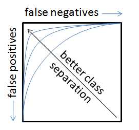
The ROC curves show similar information in a different format. The motion from left to right across the sensitivity/specificity curves is the same as moving CLOCKWISE around the ROC curve (the ROC curve is just the specificity plotted against the sensitivity with "no errors" being the point in the upper left corner of the plot). In an ideal case, the ROC curve will hit the upper left corner indicating no false positives and no false negatives.
As the classes start to overlap (e.g. due to a model which cannot sufficiently separate them), the sensitivity/specificity plots will "drop" in the middle (increased misclassification rate) and the point on the ROC curve closest to the upper left corner will move down and to the right (indicating increased false positive and increased false negative rates, respectively)

You may also want to see these FAQ items:
How are the ROC curves calculated for PLSDA?
How is the prediction probability and threshold calculated for PLSDA?
Still having problems? Check our documentation Wiki or try writing our helpdesk at helpdesk@eigenvector.com


